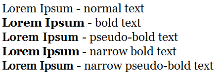
Sometimes you want to emphasize text but the bold version of a font is too “big”. With CSS 3 there is a simple way to thicken the regular font.
.pseudo-bold {
  text-shadow: 1px 0 0;
  padding-right: 1px;
  letter-spacing: 1px;
}
It creates a duplication that is shifted 1 pixel to the right, the padding and letter-spacing properties prevent overlapping. Of course such hacks will never look as nice as a real typographic bold font, so there are always other possibilities to consider. A way to make wide bold fonts more unobstrusive is reducing the letter spacing:
.narrow-bold {
  letter-spacing: -1px;
}
Here is a complete example with the Georgia font-family
<style type="text/css">
	#pseudo-bold-example {
		font-family:Georgia; font-size: 24px;
	}
	.bold {
		font-weight: bold;
	}
	.pseudo-bold {
		text-shadow: 1px 0 0;
		padding-right:1px;
		letter-spacing:1px;
	}
	.narrow-bold {
		font-weight: bold;
		letter-spacing:-1px;
	}
	.narrow-pseudo-bold {
		text-shadow: 1px 0 0;
		padding-right:1px;
	}
</style>
<div id="pseudo-bold-example">
	<p>Lorem Ipsum - normal text<br />
	<span class="bold">
		Lorem Ipsum</span> - bold text<br />
	<span class="pseudo-bold">
		Lorem Ipsum</span> - pseudo-bold text</span><br />
	<span class="narrow-bold">
		Lorem Ipsum</span> - narrow bold text<br />
	<span class="narrow-pseudo-bold">
		Lorem Ipsum</span> - narrow pseudo-bold text</span></p>
</div>
This is how it should look like:

For my current project I eventually decided to go with the narrow bold version, instead of the pseudo bold one. Bonus points: It is fully compatible with CSS 2.