I worked on a website where many images should have an inner shadow. To not need to edit all of them in Photoshop, the “inset” value for the CSS3 attribute “box-shadow” came in handy, but it cannot be applied to images without more ado. I want to show my solution here.
This is how it should look like.
Applied directly on img elements, the shadow stays behind the image, so it is only visible at all if the image has transparency. If you add a wrapper element which gets the shadow, it is still behind the image but can be positioned with z-index. Unfortunately the image has to be moved to the back, moving the wrapper to the front is not possible 1:
1) Wrapper with Box Shadow, Image in The Background
The problem with this code is that the image is not only placed behind the wrapper but behind all other elements in the same Stacking Context. Which elements form a stacking context is described quite well in the Mozilla Documentation:
the root element (HTML),
positioned (absolutely or relatively) with a z-index value other than “auto”,
a flex item with a z-index value other than “auto”,
elements with an opacity value less than 1. (See the specification for opacity),
elements with a transform value other than “none”,
elements with a mix-blend-mode value other than “normal”,
elements with isolation set to “isolate”,
on mobile WebKit and Chrome 22+, position: fixed always creates a new stacking context, even when z-index is “auto”
specifing any attribute above in will-change even you don’t write themselves directly
2) Stacking Context
In this case it was applicable to assign a z-index and relative positioning to the direct parent element of the wrapper (let’s call it #parent):
CSS
#parent {
    position: relative;
    z-index: 0;
}
If this is not possible, e.g. because it needs a different position value or the z-index has unwanted side effects, I would use opacity instead, with a value of almost 1, so that no effect is visible but it still creates a stacking context.
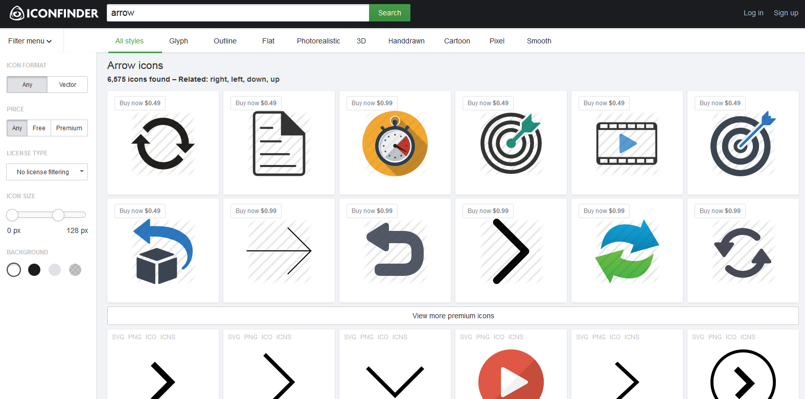
Need some icons for your (web) app but have nobody with Mad Photoshop Skills™ at hand? These three sites will help you:
Iconfinder.net
My first icon resource on the web is www.iconfinder.net. It is a very large database of icons and icon sets in various formats and sizes. They are licensed differently, so not all sets are free but even for free commercial use there are plenty. And you can filter by license.
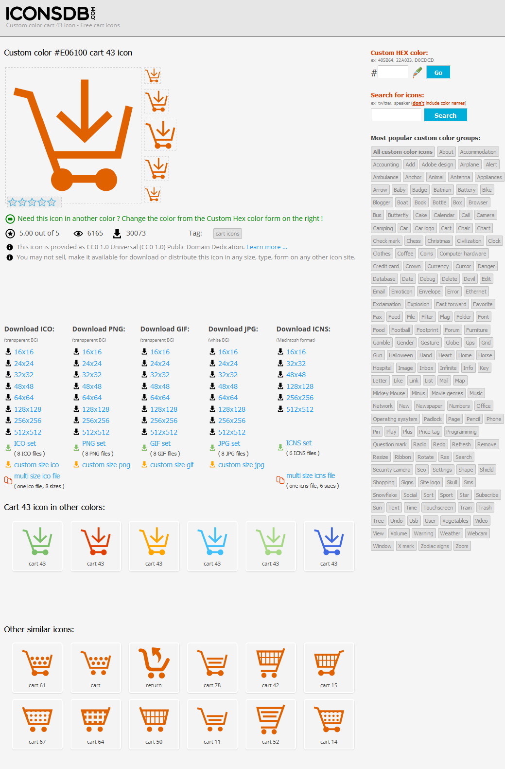
ICONSDB.com Icon Customizer
Icons DB has thousands of completely free, monochromatic customizable icons. If you need some quick simple flat icons you probably find them here. The clou: you can chose to download all of them in any color and any size as ICO, PNG, GIF, JPG or ICNS
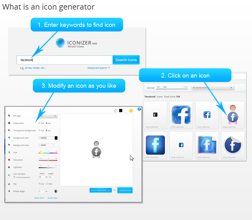
Iconizer.net Icon Generator
Iconizer is a big icon database very similar to iconfinder but adds icon customization on top. So even complex multicolor icons can be changed almost arbitrarily in color and size.
Another tip:
Choose your icons carefully to be easily recognized by most if not all of your target audience. Even widespread icons like chains for “link” only seem to be natural for geeks like us but are not for your average Joe.
Who needs to create a simple design from time to time without having too much knowledge about things like color theory, does not need to put his foot into his mouth with the colors. Here are three ressources for harmonic color palettes:
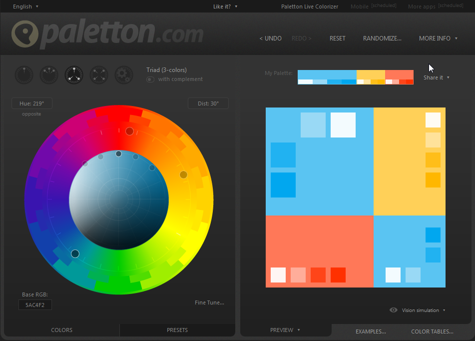
1. Paletton
Simply click and drag the points in the color wheel with your mouse and get a matching palette in real time, including a preview how the colors look like on a website. Presets for lightness and saturation like “Pastel”, “Shiny” oder “Dark” are useful as starting points.
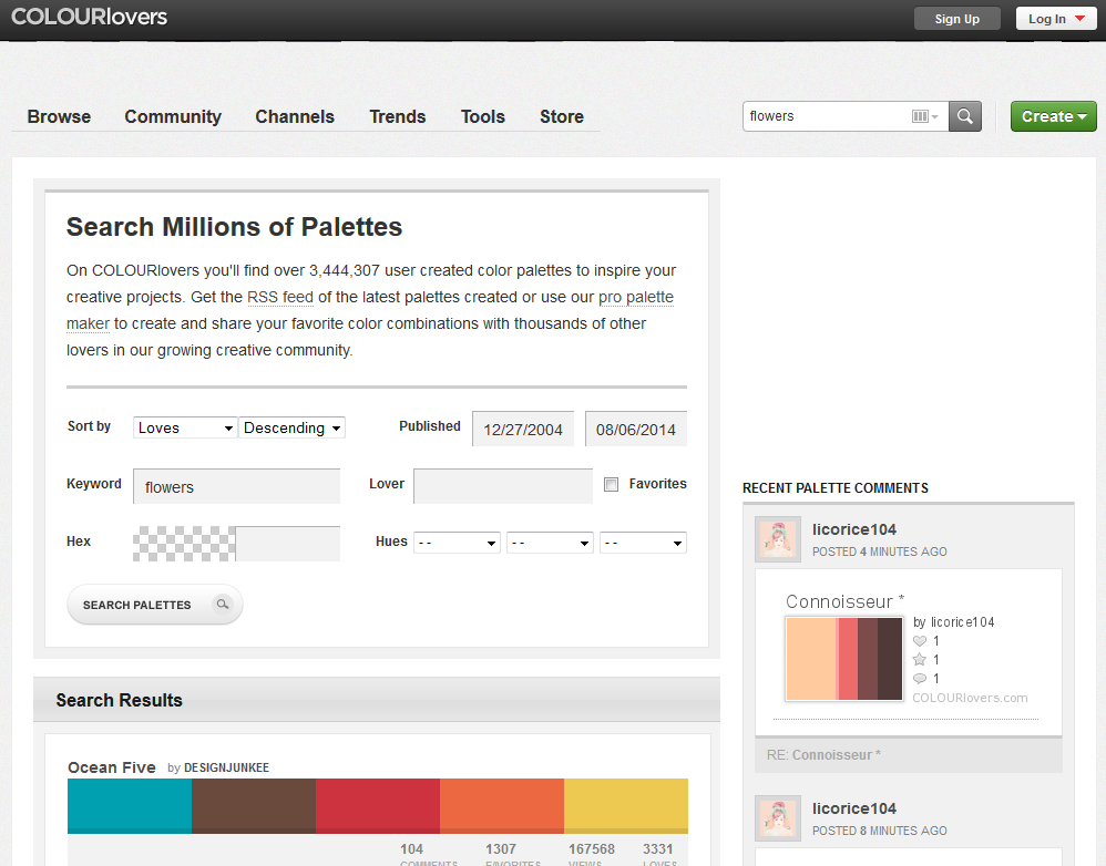
A different approach: Here designers provide color palettes as well as patterns and single colors. You can search palettes by theme, rate and comment them. Chooese from millions of hand crafted palettes!
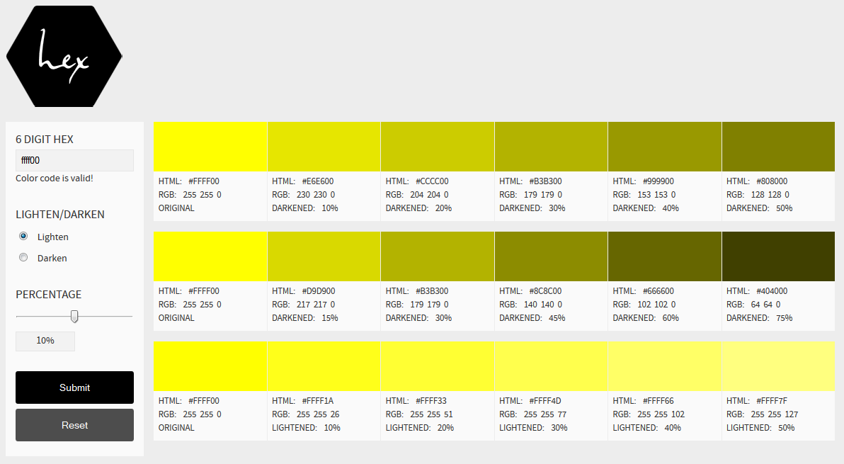
For monochromatic palettes the hex color tool suffices. Start with one color, choose the step size to lighten/darken, done. You can experiment with the inputs without losing previous results.
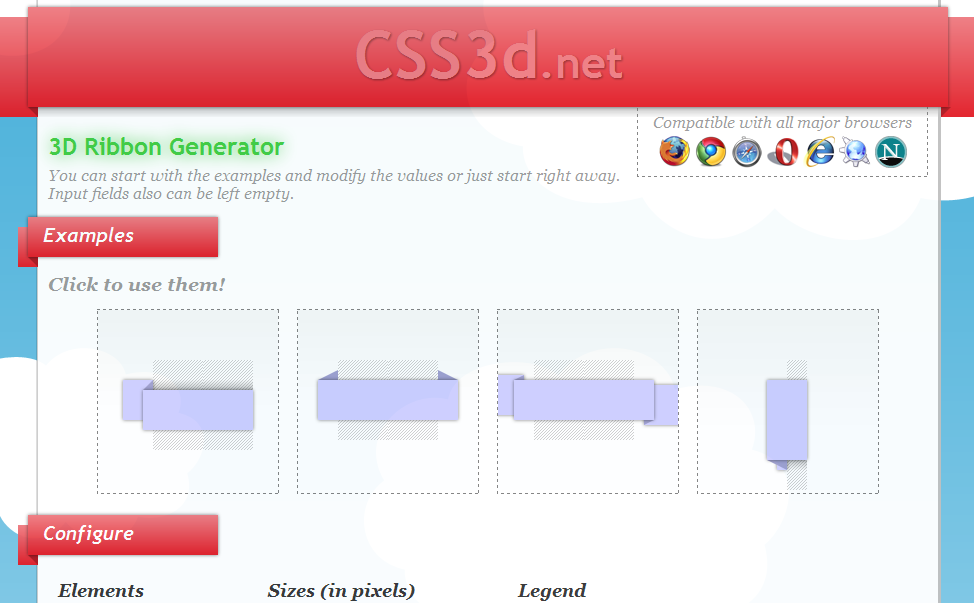
Inspired by this article on pvmgarage.com I recently created a generator for 3D CSS ribbons and made it available on css3d.net. It creates CSS and HTML code for a cross-browser compatible ribbon effect (not limited to CSS 3!) based on parameters for sizes and colors. The red headers you see in this screenshot are also generated like that:
It creates a duplication that is shifted 1 pixel to the right, the padding and letter-spacing properties prevent overlapping. Of course such hacks will never look as nice as a real typographic bold font, so there are always other possibilities to consider. A way to make wide bold fonts more unobstrusive is reducing the letter spacing:
.narrow-bold {
  letter-spacing: -1px;
}
Here is a complete example with the Georgia font-family
For my current project I eventually decided to go with the narrow bold version, instead of the pseudo bold one. Bonus points: It is fully compatible with CSS 2.
A typical CSS problem but I fall for it again and again. The whole site is shifted down 10-20 pixels in spite of every imaginable variant of margin:0 in the <html> and <body> elements.
So what was it? A <h1> somewhere in the floating layout whose margin-top pushed everything down.